Free self development lessons for Humanity
Pivot tables: The power of Excel
Otermans Institute,
in Bihar, India
Sjoerd Verhagen
Contributor, Otermans Institute
Senior Operations Research Scientist at Amazon (Logistics)
Related lessons
Some of our free lessons that you should learn after completing this lesson.
If you thought our content was useful and helped you upscale today, you can leave a donation at the below. All funds collected will be donated to the Prime Minister's National Relief Fund to support Covid-19 victims.
DONATE NOW
Pivot tables: The power of Excel
• The data
• Telling a pivot table what you want to see
• Focusing on the right things
• Tips and exercise during 'lockdown'
Excel is the most widely used spreadsheet tool in the world. With almost every business in the world using it, you are very likely to use it in your work or even for personal administration. This lesson will teach you one of the most powerful features of Excel: The pivot table. Pivot tables are a quick & easy way to understand a large set of data. Once you know how it works, it is very intuitive and even fun.
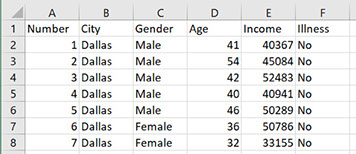
The data
I will be using an example dataset on the income and health of a group of people in the United States. This is a big table with headers in the first row, and then one row for each person. The columns contain the following information:
● Column B: City where this person lives
● Column C: Gender
● Column D: Age
● Column E: Income
● Column F: Illness (Yes/No)
Pivot tables work best when data is in this so-called ‘tidy’ format, so no blank columns or rows to make things look nice, the pivot table will organise all this for us.
The first few rows of our data
Setting up the pivot table
To set up the pivot table select all the data that you want to analyse, go to the ´Data´ ribbon on the top of the screen, and click ´PivotTable´.
Where to click to set up a pivot table

Now we can start looking at what is in our data. On the right of the screen you can select what you want to look at. For example, we might want to know what the income is of people in each of the cities for different genders. We then drag the ‘Cities’ information to the rows box, we drag ‘Gender’ to the columns box, and we drag the ‘Income’ information to the values box.
How to configure a pivot table
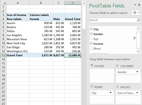
With only a few clicks, we now have a neat looking overview of who earns how much. We can see that most is earned in New York City: $4,873 million, with San Diego earning least: $492 million. Within New York City, we see that men earn more than women: £2,851 million versus £2,021 million. Knowing this, we might have a follow-up question: How less do people earn if they have an illness? The answer is just one click away. By also moving ‘illness’ to the columns box we now have a detailed table that splits the income for both men and women between the healthy and those with known illnesses. This shows us that out of the $2,021 million earned by New York City women, it is is split between $1,860 million earned by healthy women and only $162 million for women are ill. Of course, you can also put the cities on the columns, and the gender on the rows, it's whatever you prefer to visualise and find out.
Pivot table with income split on both gender and illness (yes/no)

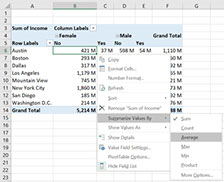
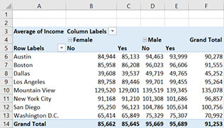
Telling a pivot table what you want to see
In our example above, we looked how total income can be split between different cities and genders. This is what pivot tables do automatically, they show you the totals. What they can also do is show averages and how many people there are in each group. If you right-click on the pivot table and go to ´Summarize values by´ and then select ´average´, you will see the average incomes. Doing this we see that those healthy and ill New York City women actually earn almost the same per person: $91,168 for healthy women versus $91,210 for those who are ill. So the difference in total earnings must be because there are more healthy women then there are ill women, interesting!
Other options are ´count´; to see how many people there are in each group, or ´max´ and ´min´ to show the highest and lowest earners.
How to switch between average and total
Focusing on the right things
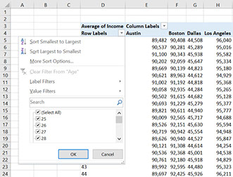
Pivot tables allow you to see the data in a neat overview, but sometimes we want to focus on a particular part of the data. For example, we might want to see how the income of people goes down as they go into retirement. To do that we might put the age on the rows. What happens then is that we get a very long table where it is hard to find the pattern. The solution to this is to filter the data. This can be done by clicking on the small triangle above the age column. Here, we can select only the larger ages, for example 55 and higher.
Click on the yellow triangle to select only the ages that you are interested in
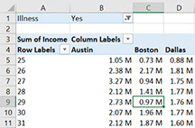
This filtering can be done in a different way as well. If we, for example, only want to consider healthy people, we can drop the ‘illness’ variable in the filter box. If we now select ‘No’ at the top of our table, the averages and sums in our table will only be calculated over healthy people.
Filtering using the filter box

Seeing the details
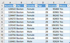
A pivot table quickly gives you useful summaries from large datasets that are too big to understand by only looking at the data. However, sometimes we do want to go back to a section of the raw data that our pivot table has pointed us to. There is a neat trick to do this, simply double click on the cell in the pivot table that you are interested in and the raw data behind that cell will be displayed. For example, if we set the ‘illness’ filter to ‘Yes’ and click on the cell for Boston, age 29, we get a list of the 11 people in this group. Neat, isn’t it?
Double click here to get a list of all 11 people in Boston age 29 with Illness
Tips & Exercises for the 'lock down'
Self: For this exercise please first download the data on incomes that we were using in our lesson. It is free to download from Kaggle via this link. Your task is to use pivot tables to find out what the highest age is of a healthy person living in Los Angeles, Dallas and New York City. In case you get stuck, try to recreate the pivot tables that we made in the lesson.
Family: Use pivot tables on some data that you or your family is interested in. There are many free datasets to look at on the Kaggle website where we got our example dataset from. Also, banks often allow you to download your personal statements in raw data. I’m curious what you will learn about the world, or yourself by working with these data sets.
This data falls under the CCO license, so no issues with using it for commercial purposes.
Got queries regarding this article, or want to learn more?
Write to us, and our trainers will get back to you.
Powered by Smatter | Design support by NUTS India